-

CSS Linear Gradient: Syntax, Angles and Real Examples
The linear-gradient() function paints a smooth transition between two or more colors along a straight line. It produces an image, so you use it anywhere CSS accepts an image: background-image, border-image, mask-image and list-style-image. That one line gives you a violet-to-coral fade from top to bottom. Everything else in the function controls direction and…
-
Gradient Border CSS: Four Methods That Work With Rounded Corners
CSS has no border-color: linear-gradient(…). The border-color property only takes plain colors. To get a gradient border you have to borrow another feature: border-image, layered backgrounds or masks. Each method has a trade-off, mostly around rounded corners and transparent centers. Method Rounded corners Transparent inside Browser support border-image No Yes All browsers Two backgrounds…
-
CSS Gradient Text
Text with a gradient running through it takes four declarations and no images. The technique paints a gradient on the element’s background, clips that background to the shape of the glyphs, then makes the text fill transparent so the background shows through. That’s the whole trick. Everything below is about doing it without breaking…
-
CSS Radial Gradient
radial-gradient() paints colour outward from a point instead of along a line. That single difference makes it the right tool for spotlights, vignettes, soft background glows and anything that should look lit rather than layered. The function has more knobs than linear-gradient(), and most of the confusion comes from two of them: shape and…
-
CSS Conic Gradients: Pie Charts, Rings and Borders
A linear gradient walks colours along a line. A radial gradient pushes them outward from a point. A conic gradient sweeps them around a point, like a clock hand, and that single difference is what makes pie charts, progress rings, colour wheels, gradient borders and checkerboards possible without a single image file or line…
-
CSS Mesh Gradients Without a Generator
CSS has no mesh-gradient() function. What people call a mesh gradient on the web is three or four radial-gradient() layers stacked in one background declaration, each with its own position, size and transparency. Get the layer order and the alpha falloff right and you have the soft, liquid, multi-colour look that every generator sells…
-
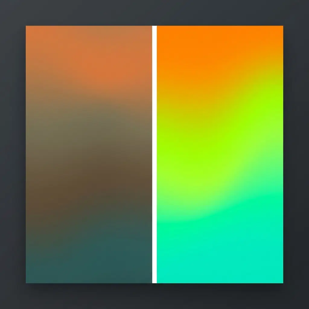
OKLCH Gradients: Fixing the Muddy Middle in CSS
A gradient from orange to teal in standard CSS produces a grey-brown band halfway across. Switch the interpolation space with linear-gradient(in oklch, …) and that band turns into a clean lime green. Nothing else about the declaration changes. Two words, and the gradient stops looking cheap. Open both in a browser and look at…