
CSS has no border-color: linear-gradient(...). The border-color property only takes plain colors. To get a gradient border you have to borrow another feature: border-image, layered backgrounds or masks. Each method has a trade-off, mostly around rounded corners and transparent centers.
| Method | Rounded corners | Transparent inside | Browser support |
|---|---|---|---|
border-image | No | Yes | All browsers |
Two backgrounds + background-clip | Yes | No (solid fill) | All browsers |
Pseudo-element + mask | Yes | Yes | All modern browsers |
| Wrapper element with padding | Yes | No | All browsers |
Method 1: border-image
The shortest version. It works on any element and with any gradient.
.box {
  border: 4px solid;
  border-image: linear-gradient(45deg, #8b5cf6, #06b6d4) 1;
}
The 1 at the end is the border-image-slice value. It tells the browser to stretch the whole gradient across the border.
The catch: border-radius has no effect on border-image. You always get square corners. Use this method for sharp-edged boxes, dividers and bottom borders.
Method 2: background-clip with two layers
This is the most common way to get a CSS border gradient with rounded corners. You paint two backgrounds: a solid one clipped to the padding box and a gradient clipped to the border box. The transparent border lets the gradient show through.
.card {
  border: 3px solid transparent;
  border-radius: 16px;
  background:
    linear-gradient(#0f172a, #0f172a) padding-box,
    linear-gradient(135deg, #8b5cf6, #06b6d4, #ec4899) border-box;
}
The inner layer is written as a gradient with two identical colors because the background shorthand only accepts one plain color, and only in the final layer.
The catch: the inside has to be a solid color (or an image). You can’t see the page behind the card.
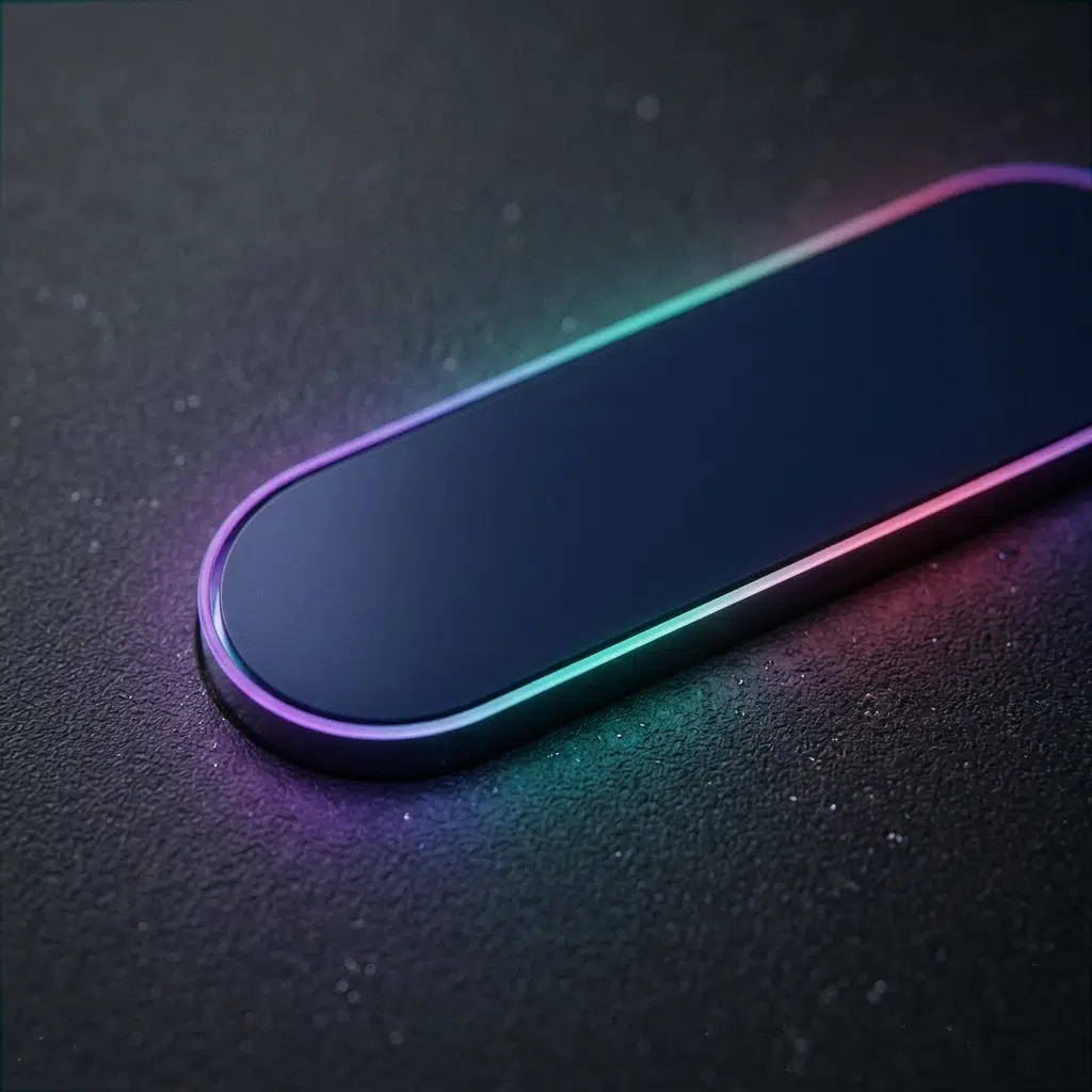
Method 3: mask for a transparent center
When the card sits on top of a photo or pattern, you need a border-only gradient with a see-through middle. A pseudo-element plus mask cuts the center out.
.glass {
  position: relative;
  border-radius: 16px;
}

.glass::before {
  content: "";
  position: absolute;
  inset: 0;
  padding: 3px;                       /* border width */
  border-radius: inherit;
  background: linear-gradient(135deg, #8b5cf6, #06b6d4);
  mask:
    linear-gradient(#000 0 0) content-box exclude,
    linear-gradient(#000 0 0);
  pointer-events: none;
}
The mask paints two full layers, one limited to the content box, and exclude keeps only the area where they don’t overlap: the padding ring. Older Safari versions need the prefixed form:
-webkit-mask:
  linear-gradient(#000 0 0) content-box,
  linear-gradient(#000 0 0);
-webkit-mask-composite: xor;
Method 4: wrapper element
If you can’t use pseudo-elements, wrap the content in a container with a gradient background and padding equal to the border width.
<div class="outer">
  <div class="inner">Content</div>
</div>
.outer {
padding: 3px;
border-radius: 16px;
background: linear-gradient(90deg, #f97316, #ec4899);
}
.inner {
border-radius: 13px; /* outer radius minus border width */
background: #fff;
}Animated gradient border
A rotating border needs an angle that the browser can interpolate. Register a custom property with @property, then animate it inside a CSS conic gradient.
@property --angle {
  syntax: "<angle>";
  inherits: false;
  initial-value: 0deg;
}

.spin-border {
  border: 3px solid transparent;
  border-radius: 16px;
  background:
    linear-gradient(#0f172a, #0f172a) padding-box,
    conic-gradient(from var(--angle), #8b5cf6, #06b6d4, #ec4899, #8b5cf6) border-box;
  animation: rotate 4s linear infinite;
}

@keyframes rotate {
  to { --angle: 360deg; }
}

@media (prefers-reduced-motion: reduce) {
  .spin-border { animation: none; }
}
Without @property, the browser treats --angle as a string and jumps from start to finish with no motion in between.
Gradient border bottom only
For an underline or a section divider, border-image works well because rounded corners don’t matter:
.title {
  border-bottom: 3px solid;
  border-image: linear-gradient(90deg, #8b5cf6, #06b6d4) 1;
}
Or skip borders and paint the line as a sized background:
.title {
  background: linear-gradient(90deg, #8b5cf6, #06b6d4) bottom / 100% 3px no-repeat;
  padding-bottom: 6px;
}
The second version lets you animate the width on hover by changing background-size.
Tailwind CSS gradient border
Tailwind has no gradient border utility. Use the wrapper method with utility classes. In Tailwind v3:
<div class="rounded-2xl bg-gradient-to-r from-violet-500 to-cyan-400 p-[3px]">
  <div class="rounded-[13px] bg-slate-900 p-6">Content</div>
</div>
In Tailwind v4 the class names changed to bg-linear-to-r. The other classes stay the same.
Choosing your gradient
Every method above accepts any gradient type. A linear gradient CSS value gives a directional sweep. A conic gradient wraps colors around the box, which looks better on square cards and avatars. To try conic color combinations before you paste them into a border, use the Conic.css generator and copy the result into the border-box layer.

FAQ
Can I use border-radius with border-image?
No. Browsers ignore border-radius when border-image is set. Use the background-clip or mask method for rounded corners.
How do I make a gradient border with a transparent background?
Use the pseudo-element and mask method. The other methods need a solid fill inside the border.
Is there a CSS border gradient generator?
You can generate the gradient itself in any gradient tool and paste it into the border-box layer of method 2. The border width comes from the border property, not the gradient.
Why is my gradient border blurry or uneven?
Check that the inner radius equals the outer radius minus the border width in the wrapper method. In the background-clip method, the browser calculates this for you.
Does a gradient border affect layout?
Methods 1, 2 and 4 take up space like a normal border or padding. The mask method draws on a pseudo-element, so it doesn’t change the box size.