radial-gradient() paints colour outward from a point instead of along a line. That single difference makes it the right tool for spotlights, vignettes, soft background glows and anything that should look lit rather than layered.
The function has more knobs than linear-gradient(), and most of the confusion comes from two of them: shape and size.
The syntax, in one block
.box {
  background: radial-gradient(circle, #4f7cff, #0b1020);
}

/* full form */
background: radial-gradient(
  [shape] [size] at [position],
  color-stop,
  color-stop
);
Everything before the first comma is optional. Leave it all out and the browser gives you an ellipse, sized to farthest-corner, centred in the box.
Shape: circle or ellipse
.circle  { background: radial-gradient(circle, #fff, #111); }
.ellipse { background: radial-gradient(ellipse, #fff, #111); }
The default is ellipse, which stretches with the element, so a wide div gets a wide oval. If a gradient looks squashed on large screens, this is why.
Size: four keywords and two numbers
| Keyword | Where the final colour stop lands |
|---|---|
| closest-side | At the nearest edge of the box |
| closest-corner | At the nearest corner |
| farthest-side | At the furthest edge |
| farthest-corner | At the furthest corner, the default |
/* explicit sizes: a circle takes one radius, an ellipse two */
background: radial-gradient(circle 120px at 30% 40%, #ffd166, transparent);
background: radial-gradient(ellipse 60% 40% at center, #ffd166, transparent);
Explicit sizes are what you want for a controlled glow. Keywords are what you want when the effect should scale with the element.
Position
background: radial-gradient(circle at top right, #22d3ee, #0f172a 70%);
background: radial-gradient(circle at 15% 85%, #22d3ee, #0f172a 70%);
at takes the same values as background-position. Off-centre placement is what makes a gradient read as a light source rather than as decoration.
Colour stops and hard edges
background: radial-gradient(
  circle at 50% 30%,
  #ffffff 0%,
  #7dd3fc 35%,
  #1e3a8a 100%
);

/* repeat a colour at two positions for a hard edge */
background: radial-gradient(circle, #ef4444 0 40px, #111827 40px 100%);
The grey halo, and how to avoid it
/* grey ring in the middle, avoid */
background: radial-gradient(circle, #ef4444, transparent);

/* clean fade */
background: radial-gradient(circle, rgb(239 68 68 / 1), rgb(239 68 68 / 0));
The reason is interpolation. transparent computes to transparent black, so the midpoint drifts toward grey. Fade to the same colour with zero alpha instead.
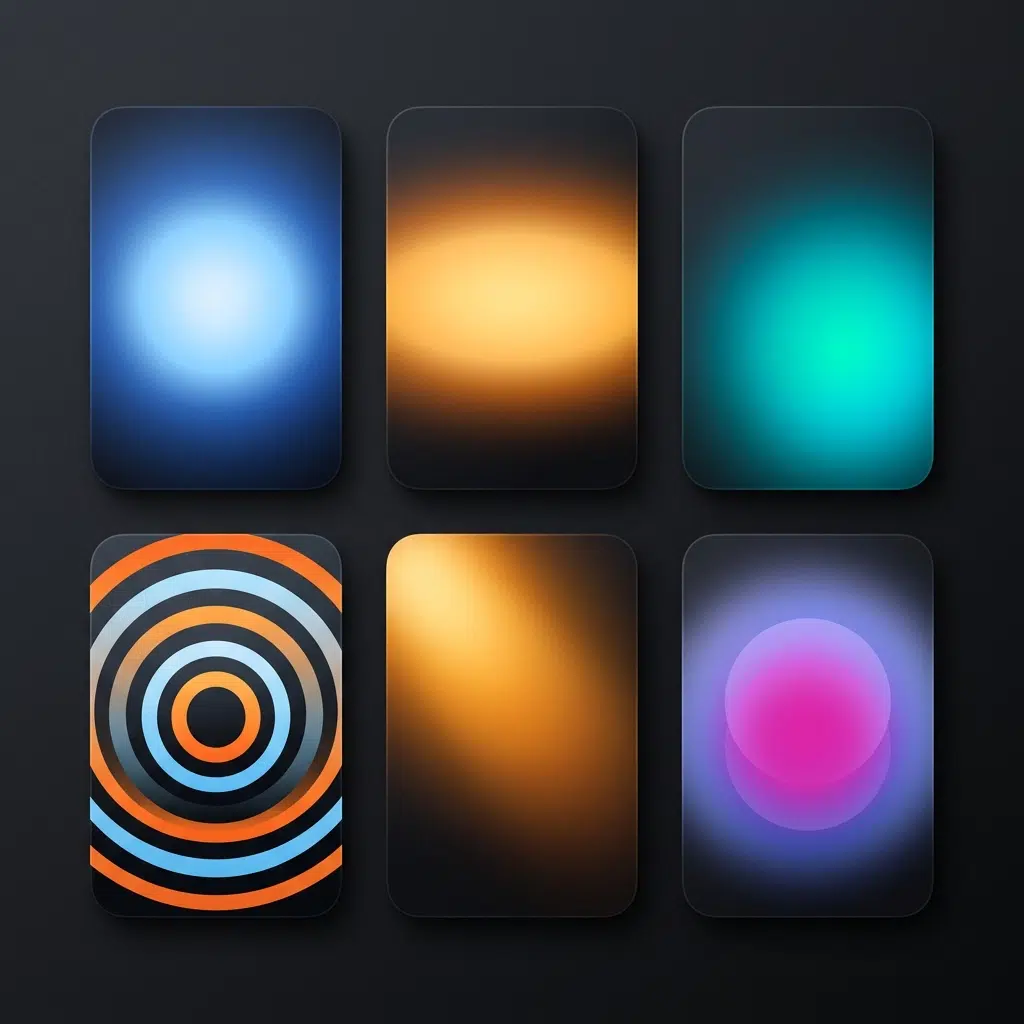
repeating-radial-gradient
.target {
  background: repeating-radial-gradient(
    circle at center,
    #0ea5e9 0 10px,
    #082f49 10px 20px
  );
}
Rings without any images. Keep the band widths even, or they shimmer as the page scrolls.
A vignette over an image
.hero {
  background:
    radial-gradient(ellipse at center, transparent 40%, rgb(0 0 0 / 0.65) 100%),
    url("hero.jpg") center / cover;
}
Spotlights behind content
.section {
  background:
    radial-gradient(circle 600px at 50% 0%, rgb(79 124 255 / 0.35), transparent 70%),
    #0b1020;
}
Several light sources at once
body {
  background:
    radial-gradient(circle 400px at 15% 20%, rgb(236 72 153 / 0.35), transparent 60%),
    radial-gradient(circle 500px at 85% 30%, rgb(56 189 248 / 0.35), transparent 60%),
    #05070f;
}
Stacked gradients render first to last, so the first one sits on top. This is the quickest way to build an ambient background that costs nothing in requests.
Animating it
/* gradient definitions do not interpolate, so animate position */
.glow {
  background: radial-gradient(circle 300px at 0% 50%, rgb(99 102 241 / 0.5), transparent 70%);
  background-size: 200% 100%;
  animation: sweep 8s ease-in-out infinite alternate;
}

@keyframes sweep {
  to { background-position: 100% 0; }
}

@media (prefers-reduced-motion: reduce) {
  .glow { animation: none; }
}
Legacy prefixes
You still find -moz-radial-gradient and -webkit-radial-gradient in old stylesheets and in email templates. Current browsers all support the unprefixed function, and the old syntax used a different argument order, which is why pasting an answer from 2012 produces nothing at all.
/* email: solid colour first, gradient second */
.email-panel {
  background-color: #0b1020;
  background-image: radial-gradient(circle at top, #1e3a8a, #0b1020);
}
Common mistakes
- Putting it on
background-color. Gradients are images, so they belong inbackgroundorbackground-image - No fallback colour for contexts that strip background images
- Animating the gradient definition rather than the position
- Banding on large soft gradients, which a faint noise overlay or a shifted mid stop fixes
- Expecting an ellipse to stay circular on a wide element
Where it fits next to the other gradient functions
Angular colour runs on a different function, covered in CSS conic gradients. Smoother blends without the muddy midpoint come from a perceptual colour space, which is the subject of OKLCH gradients. For soft multi-point backgrounds built from several radial layers, see CSS mesh gradients.
FAQ
What is the default shape of a radial gradient?
An ellipse sized to farthest-corner, centred in the element.
How do I position a radial gradient?
With the at keyword, for example radial-gradient(circle at 20% 80%, ...).
Why does my gradient fade to grey?
Because transparent is transparent black. Fade to the same colour with zero alpha instead.
Can I use radial gradients for borders?
Yes, through border-image, or with a wrapper that uses padding plus background-clip.
Is -moz-radial-gradient still needed?
No, not for current browsers. Keep it only for legacy email clients, and always with a solid background colour behind it.
Do gradients hurt performance?
Rarely on their own. Large animated gradients repainted every frame do, which is why moving the background position beats regenerating the gradient.