Text with a gradient running through it takes four declarations and no images. The technique paints a gradient on the element’s background, clips that background to the shape of the glyphs, then makes the text fill transparent so the background shows through.
.gradient-text {
  background-image: linear-gradient(90deg, #4f7cff, #ec4899);
  -webkit-background-clip: text;
  background-clip: text;
  color: transparent;
}
That’s the whole trick. Everything below is about doing it without breaking readability.
Why the -webkit- prefix is still there
background-clip: text shipped in WebKit long before it was standardised, and the prefixed property remains the one some browsers honour for the text value. Writing both lines costs nothing and avoids a bug class that only shows up on someone else’s phone. Order matters: prefixed first, standard second.
The fallback that actually matters
color: transparent is a loaded gun. If the background image fails to paint for any reason, the text disappears completely.
.gradient-text {
  color: #4f7cff;                       /* real colour, always declared first */
  background-image: linear-gradient(90deg, #4f7cff, #ec4899);
  -webkit-background-clip: text;
  background-clip: text;
  -webkit-text-fill-color: transparent; /* safer than color: transparent */
}
Browsers that don’t understand -webkit-text-fill-color keep the declared color and render ordinary readable text.
The feature query version
.gradient-text { color: #4f7cff; }

@supports (background-clip: text) or (-webkit-background-clip: text) {
  .gradient-text {
    background-image: linear-gradient(90deg, #4f7cff, #ec4899);
    -webkit-background-clip: text;
    background-clip: text;
    -webkit-text-fill-color: transparent;
  }
}
Controlling the gradient across the text
By default the gradient spans the element’s box, not the text. A heading in a full-width container gets a barely visible colour shift, because the interesting part of the gradient happens out in the empty space.
/* shrink the box to the text */
.gradient-text { display: inline-block; }

/* or size the background explicitly */
.gradient-text {
  background-size: 200% 100%;
  background-position: center;
}
Inline-block is usually enough, and it also stops the gradient restarting on each wrapped line.
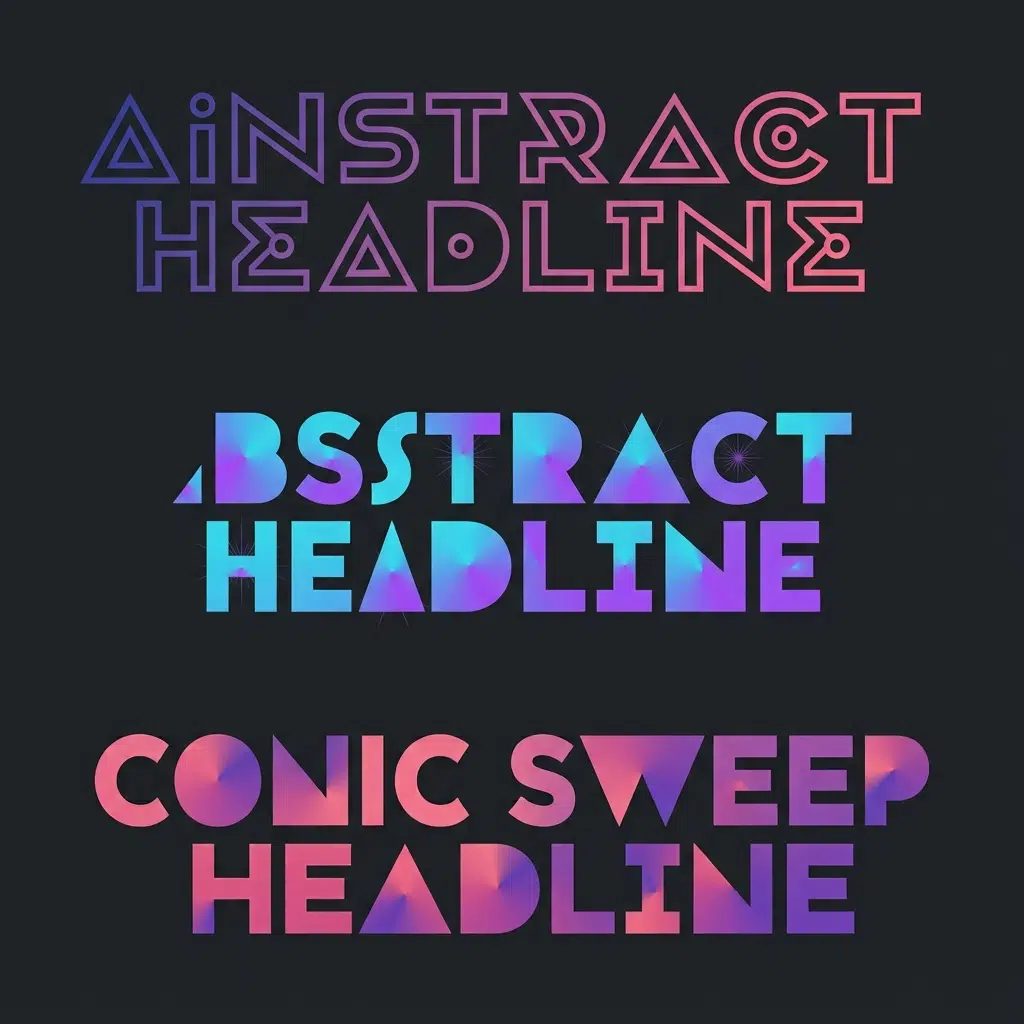
Animated gradient text
.animated-text {
  background-image: linear-gradient(90deg, #4f7cff, #ec4899, #f59e0b, #4f7cff);
  background-size: 300% 100%;
  -webkit-background-clip: text;
  background-clip: text;
  -webkit-text-fill-color: transparent;
  animation: slide 6s linear infinite;
}

@keyframes slide {
  to { background-position: 300% 0; }
}

@media (prefers-reduced-motion: reduce) {
  .animated-text { animation: none; }
}
Gradients can’t be interpolated directly, so the animation moves the background instead. Repeat the first colour at the end of the stop list so the loop doesn’t jump.
Conic and radial variants
.radial-text {
  background-image: radial-gradient(circle at 30% 50%, #22d3ee, #4338ca);
}

.conic-text {
  background-image: conic-gradient(from 180deg, #f43f5e, #8b5cf6, #f43f5e);
}
Any gradient function works. Conic gives a metallic sweep that reads well on large display type, and the mechanics are in CSS conic gradients. The radial function is covered in CSS radial gradients, and if the blend looks muddy in the middle, OKLCH gradients explains why.
Multi-line text
Wrapped text splits the background across line boxes in ways that look wrong with display: inline. Use inline-block or a block-level element, and accept that the gradient runs across the whole block, which is normally the better look anyway.
Tailwind
<h1 class="bg-gradient-to-r from-indigo-500 to-pink-500 bg-clip-text text-transparent">
  Gradient heading
</h1>
Same mechanism, same caveat: text-transparent means no fallback colour, so keep it off body copy.
Accessibility, and where not to use it
Contrast checkers measure a single foreground colour against a background. Gradient text has no single colour, so check the weakest point of the gradient against your background and make sure that passes.
- Display headings only, never body text, labels or links inside paragraphs
- Keep both ends of the gradient in the same lightness range, or the text looks broken rather than styled
- Don’t put gradient text on a gradient background
- Avoid it for anything a user must read under pressure, such as error messages
- Remember that selection and highlight styling behaves oddly with a transparent fill
Common problems
| Symptom | Cause | Fix |
|---|---|---|
| Text invisible | Background image failed, fill transparent | Use -webkit-text-fill-color with a real colour fallback |
| Gradient barely visible | Box much wider than the text | display: inline-block, or set background-size |
| Animation stutters | Animating the gradient definition | Animate background-position instead |
| Effect gone in Safari | Missing prefixed declaration | Add -webkit-background-clip: text |
| Emoji turn grey | Clip applies to every glyph | Put emoji in a separate span without the class |
FAQ
How do I make gradient text in CSS?
Set a gradient as the background image, clip it with background-clip: text plus the webkit prefix, and make the text fill transparent.
Does it work in all browsers?
Current versions of the major browsers support it. Keep the prefixed declaration and a fallback colour for everything else.
Can I animate gradient text?
Yes, by animating background-position over an oversized background, and by respecting reduced-motion preferences.
Is gradient text bad for SEO?
No. It’s real text in the DOM, not an image, so it’s read and indexed normally.
Can I use it on buttons?
You can, but contrast on interactive elements matters more. A solid label on a gradient background is the safer pattern.
Why do my emoji lose their colour?
Because the clip applies to every glyph in the element. Wrap the emoji in its own span and leave the class off that span.