A linear gradient walks colours along a line. A radial gradient pushes them outward from a point. A conic gradient sweeps them around a point, like a clock hand, and that single difference is what makes pie charts, progress rings, colour wheels, gradient borders and checkerboards possible without a single image file or line of JavaScript.
It’s also the gradient most likely to look wrong on your first attempt, because two things bite: the seam where the sweep closes, and banding in the wide colour transitions. Both are fixable, and the rest of the property is worth knowing.
In short: conic-gradient() sweeps colours around a centre point instead of along a line. Position stops in angles or percentages, repeat the first colour as the last stop to close the seam, and interpolate in oklch to kill banding. That covers pie charts, progress rings, gradient borders and checkerboards, with no images and no JavaScript.
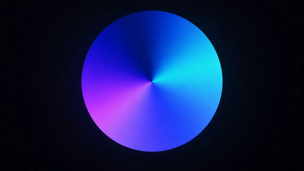
The syntax, in one block
.el {
  background: conic-gradient(
    from 0deg          /* where the sweep starts */
    at 50% 50%,        /* the centre point */
    red, yellow, lime, aqua, blue, magenta, red
  );
}
Both from and at are optional. Leave them out and you get a sweep starting at 12 o’clock, centred on the box.
Colour stops are positioned in angles or percentages, where 100% equals 360deg. These two are identical:
conic-gradient(#e63 0deg 90deg, #2a9 90deg 360deg)
conic-gradient(#e63 0% 25%,     #2a9 25% 100%)
Percentages read better for charts, angles read better for anything rotational. Pick one per project and stay with it.
from and at: rotation and centre point
from rotates the entire gradient. It’s the cheapest way to align a chart or spin a ring, and unlike transform: rotate() it doesn’t move the element’s box, so nothing around it reflows.
/* start the first slice at 3 o'clock instead of 12 */
background: conic-gradient(from 90deg, #e63 0 25%, #2a9 0);
Negative angles work. So do turn units, which are often clearer: from 0.25turn is quarter past.
at moves the origin. Put it outside the box and you get a wedge of a much larger sweep, which is the trick behind those diagonal spotlight backgrounds you see on landing pages.
/* the visible area is a narrow slice of a huge sweep */
background: conic-gradient(from 200deg at 120% 130%, #10162f, #2b3a67, #10162f);
Hard stops, and why pie charts are one line of CSS
When two colour stops sit at the same position, the transition between them has zero width. That’s a hard stop, and it turns a gradient into flat segments.
The shorthand you’ll end up using is the 0 trick. A stop position of 0 that comes after a larger position gets clamped up to the preceding value, so you never have to repeat numbers:
.pie {
  width: 200px;
  aspect-ratio: 1;
  border-radius: 50%;
  background: conic-gradient(
    #4f7cff 0 35%,
    #22b8a0 0 60%,
    #f5a524 0 82%,
    #ef4444 0
  );
}
Four slices, four lines, no library. Add border-radius: 50% and the square becomes a disc. Drop the radius and you have a segmented square, which is useful for progress bars laid out radially inside a card.
One caution: a pie chart drawn this way is decoration as far as assistive technology is concerned. If the numbers matter, put them in the DOM as text or a table and let the gradient be the visual layer.

Progress rings without SVG
Take the pie, punch a hole in it with a mask, and you have a ring. This replaces a surprising amount of SVG boilerplate.
.ring {
  --p: 68;          /* percent complete */
  --size: 140px;
  --thickness: 14px;

  width: var(--size);
  aspect-ratio: 1;
  border-radius: 50%;
  background: conic-gradient(
    #4f7cff calc(var(--p) * 1%),
    #e6e8ee 0
  );
  mask: radial-gradient(
    farthest-side,
    #0000 calc(100% - var(--thickness)),
    #000 0
  );
}
The mask is a radial gradient that’s transparent in the middle and opaque at the edge. Everything outside the thickness band gets erased. Change --p from JavaScript, or set it inline from your template, and the ring updates.
Rounded caps are the one thing this technique doesn’t give you for free. If a design calls for them, use two small absolutely positioned circles at the start and end angles, or accept SVG for that specific component.

Gradient borders on rounded corners
You can’t put a gradient in border-color. The standard workaround stacks two backgrounds with different clipping boxes.
.card {
  border: 2px solid transparent;
  border-radius: 16px;
  background:
    linear-gradient(#0f1117, #0f1117) padding-box,
    conic-gradient(from 140deg, #4f7cff, #a855f7, #22d3ee, #4f7cff) border-box;
}
The first layer fills the padding box with the card’s own background. The second fills the border box with the gradient. What’s left visible of the gradient is exactly the border ring, corners included, which is why this beats a pseudo-element for rounded shapes.
The catch is that the card background must be opaque. Over a photo or a glass surface, use the mask approach instead:
.card {
  position: relative;
  border-radius: 16px;
}
.card::before {
  content: "";
  position: absolute;
  inset: 0;
  padding: 2px;              /* border thickness */
  border-radius: inherit;
  background: conic-gradient(from 140deg, #4f7cff, #a855f7, #22d3ee, #4f7cff);
  mask:
    linear-gradient(#000 0 0) content-box,
    linear-gradient(#000 0 0);
  mask-composite: exclude;
  pointer-events: none;
}
Two masks, one clipped to the content box, one covering everything, composited with exclude. The difference between them is the ring. Transparent underneath, works over anything.
repeating-conic-gradient
Same property, but the stop list tiles around the circle instead of covering it once. Checkerboards become trivial:
.checker {
  background:
    repeating-conic-gradient(#e6e8ee 0 25%, #ffffff 0 50%)
    0 0 / 24px 24px;
}
Read it as: quarter of the sweep grey, next quarter white, repeat. That produces a two by two tile, and background-size sets how big each tile is. This is the standard transparency backdrop in every image editor, in three lines.
Narrow the segments and you get a starburst, useful behind hero sections:
background: repeating-conic-gradient(
  from 0deg,
  #ffffff08 0deg 6deg,
  #0000 6deg 12deg
);
The banding problem, and fixing it in OKLCH
Conic gradients band more visibly than linear ones. A 360 degree sweep covers a lot of angular distance, and near the centre the same colour range is compressed into a handful of pixels while at the outer edge it’s stretched across hundreds. You get visible rings near the middle and stair steps near the rim.
Interpolating in a perceptually uniform space fixes most of it, because the steps between adjacent colours become evenly sized to the eye rather than evenly sized in sRGB’s distorted coordinates:
background: conic-gradient(in oklch, #4f7cff, #22d3ee, #4f7cff);The interpolation keyword goes immediately after the opening parenthesis, before from if you have one. This is the same mechanism covered in detail in our piece on OKLCH gradients, and it matters more here than anywhere else, because the muddy middle of a conic sweep is repeated around the entire circle.
If banding survives that, add noise. A tiny transparent PNG or an SVG turbulence filter overlaid at very low opacity breaks up the flat regions:
.grad::after {
  content: "";
  position: absolute;
  inset: 0;
  opacity: .035;
  background-image: url("data:image/svg+xml,%3Csvg xmlns='http://www.w3.org/2000/svg'%3E%3Cfilter id='n'%3E%3CfeTurbulence baseFrequency='.8'/%3E%3C/filter%3E%3Crect width='100%25' height='100%25' filter='url(%23n)'/%3E%3C/svg%3E");
  pointer-events: none;
}
Hue interpolation and the closing seam
The classic conic mistake is a hard line at 0 degrees. It happens whenever the first and last stops aren’t the same colour, because the sweep has to close and there’s nowhere for the transition to go.
/* visible seam at 12 o'clock */
conic-gradient(#4f7cff, #f5a524)

/* seamless */
conic-gradient(#4f7cff, #f5a524, #4f7cff)
Always close the loop. For a full colour wheel there’s a shorter way, using hue interpolation to travel the long way around from a colour back to itself:
.wheel {
  border-radius: 50%;
  background: conic-gradient(in oklch longer hue, oklch(70% 0.2 0), oklch(70% 0.2 360));
}
The hue strategy is set alongside the interpolation space, the same way it works for OKLCH gradients. Four exist: shorter hue (the default, takes the short arc), longer hue (the long arc, which is what produces a full wheel), increasing hue and decreasing hue (forced direction). If a two-colour gradient is passing through a colour you didn’t ask for, the hue strategy is why.
Animating the angle properly
You cannot transition a gradient. CSS has no way to interpolate between two background-image values, so animating the from angle directly does nothing.
@property solves it by giving a custom property a real type, which makes it animatable:
@property --angle {
  syntax: "<angle>";
  inherits: false;
  initial-value: 0deg;
}

.spinner {
  --angle: 0deg;
  background: conic-gradient(from var(--angle), #4f7cff, #a855f7, #4f7cff);
  animation: spin 4s linear infinite;
}

@keyframes spin {
  to { --angle: 360deg; }
}

@media (prefers-reduced-motion: reduce) {
  .spinner { animation: none; }
}
Note what this is not doing: it isn’t rotating the element. A transform: rotate() on a square with a conic background would rotate the box and its children too. Animating the angle keeps everything else still.
The reduced-motion query isn’t optional courtesy. A continuously rotating high-contrast sweep is a genuine trigger for some vestibular conditions.
Conic gradients as masks
Everything above uses conic gradients as paint. They work as masks too, which is how you reveal content along a sweep.
.reveal {
  --p: 40;
  mask: conic-gradient(#000 calc(var(--p) * 1%), #0000 0);
}
Any element, image included, now appears only within the first 40 percent of the sweep. Combine with the @property animation above and you get a wipe reveal with no extra markup.
Stacking and layering
Multiple gradients in one background declaration paint front to back, first listed on top. Anything below the first fully opaque layer is invisible, so every layer except the last needs transparency somewhere.
background:
  conic-gradient(from 0deg at 20% 10%, #4f7cff55, #0000 40%),
  conic-gradient(from 180deg at 80% 90%, #a855f755, #0000 45%),
  #0b0d12;
Two off-centre sweeps over a solid base gives an ambient background that reads as lighting rather than as a gradient. Push it further with more layers and blend modes and you’re in the same territory as a CSS mesh gradient, which uses the same stacking principle with radial layers.
When layering, set the interpolation space on every layer. Mixing an in oklch layer with a default sRGB layer produces a subtle mismatch in the overlap that’s hard to diagnose later.
Copy-paste presets
/* Donut chart, four segments */
.donut {
  aspect-ratio: 1;
  border-radius: 50%;
  background: conic-gradient(#4f7cff 0 35%, #22b8a0 0 60%, #f5a524 0 82%, #ef4444 0);
  mask: radial-gradient(farthest-side, #0000 62%, #000 0);
}

/* Animated gradient border */
@property --a { syntax: "<angle>"; inherits: false; initial-value: 0deg; }
.glow {
  border: 1.5px solid transparent;
  border-radius: 14px;
  background:
    linear-gradient(#0f1117, #0f1117) padding-box,
    conic-gradient(from var(--a), #4f7cff, #22d3ee, #a855f7, #4f7cff) border-box;
  animation: rot 6s linear infinite;
}
@keyframes rot { to { --a: 360deg; } }

/* Transparency checkerboard */
.alpha { background: repeating-conic-gradient(#dfe3ea 0 25%, #fff 0 50%) 0 0 / 20px 20px; }

/* Radial starburst backdrop */
.rays { background: repeating-conic-gradient(from 0deg, #ffffff0a 0 4deg, #0000 4deg 10deg); }

/* Sunset corner light */
.aurora {
  background:
    conic-gradient(in oklch from 210deg at 110% -10%, #ff8a4c, #ff3d81 30%, #0000 55%),
    #0b0d12;
}
Browser support and fallbacks
conic-gradient() itself has been supported across Chrome, Safari, Firefox and Edge for years. You do not need a fallback for the property in 2026.
The newer parts need a little care:
| Feature | Status | Fallback approach |
|---|---|---|
conic-gradient() | Universally supported | None needed |
in oklch interpolation | Modern engines | Declare a plain version first, then override |
@property | Modern engines | Animation silently does nothing, layout unaffected |
mask-composite | Modern engines, prefix history | Feature query, or padding-box border technique |
The cascade handles the interpolation fallback with no feature query at all, because an older engine discards the declaration it can’t parse:
background: conic-gradient(#4f7cff, #22d3ee, #4f7cff);
background: conic-gradient(in oklch, #4f7cff, #22d3ee, #4f7cff);
For anything conditional beyond that, @supports is the tool:
@supports (mask-composite: exclude) {
  /* the transparent-background border technique */
}
Performance notes
A static conic gradient is cheap. It rasterises once and behaves like any other painted background. Replacing a decorative PNG with one is almost always a net win: no request, no decode, no layout shift, and it scales to any size and any pixel density.
An animated one is a different question. Animating --angle forces a repaint of the painted area on every frame, and the cost scales with area. A 48 pixel spinner is free. A full viewport animated sweep on a mid-range phone is not, and it will show up in your INP measurements if it’s competing with interaction handling.
Three practical rules: keep animated gradients small, don’t animate more than one or two on screen at once, and give the animated element will-change: background only if profiling shows it helps. Adding it speculatively costs memory and often makes things worse.
Debugging a conic gradient that looks wrong
| Symptom | Cause | Fix |
|---|---|---|
| Hard line at 12 o’clock | First and last stop differ | Repeat the first colour as the last stop |
| Ellipse instead of a circle | Box isn’t square | aspect-ratio: 1 |
| Chart segments off by a slice | Sweep starts at 12, chart expects 3 | from 90deg |
| Grey band between two vivid colours | sRGB interpolation | in oklch |
| Unexpected colour in a two-stop gradient | Hue takes the long arc | Set shorter hue explicitly |
| Animation does nothing | No @property declaration | Register the custom property with a syntax |
| Ring has no hole | Mask radius exceeds the box | Check the calc() in the radial mask |
| Gradient border invisible | Border colour isn’t transparent | border: Npx solid transparent |
Where this pays off immediately
Three replacements worth making on almost any project. Swap SVG donut charts for the mask technique and delete a dependency. Swap the pseudo-element gradient borders that break on rounded corners for the padding-box version. Swap decorative background images for stacked off-centre sweeps and remove the requests entirely.
None of these are clever tricks. They’re the plain use of a property that’s been stable in every browser for years and still gets treated as exotic.
FAQ
What’s the difference between conic and radial gradients?
Radial changes colour with distance from the centre, producing rings. Conic changes colour with angle around the centre, producing wedges. Radial gives you glows and spotlights, conic gives you charts, wheels and sweeps.
Can I make a pie chart with real data?
Yes. Write the segment boundaries as custom properties, set them from your template or from JavaScript, and build the stop list with calc(). The gradient recalculates automatically. Keep the underlying numbers in the DOM for accessibility.
Why does my gradient look pixelated near the centre?
Near the origin, the full colour range is compressed into very few pixels, so quantisation is unavoidable. Move the centre outside the visible area with at, or cover the middle with a mask, which is what a donut does anyway.
Can conic gradients be used in border-image?
They can, but border-image ignores border-radius, so the corners come out square. For rounded elements use the padding-box or mask-composite technique instead.
Do conic gradients work in dark mode?
They’re colours, so define them as custom properties and redefine those properties in your dark theme block. Watch chroma: a saturated sweep that reads as energetic on white often reads as neon on a dark surface, and usually wants its lightness and chroma pulled down.
Is a conic gradient faster than an image?
For a static decorative background, yes, comfortably. No request, no decode, no cache concerns, resolution independent. For a large continuously animated area, an optimised video or a canvas may cost less, though at that point the design decision is worth revisiting.