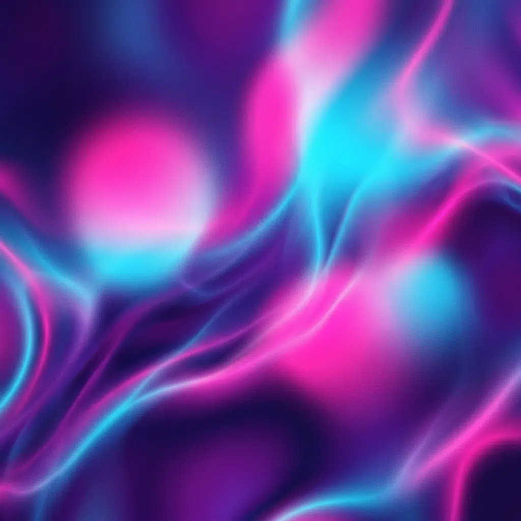
CSS has no mesh-gradient() function. What people call a mesh gradient on the web is three or four radial-gradient() layers stacked in one background declaration, each with its own position, size and transparency. Get the layer order and the alpha falloff right and you have the soft, liquid, multi-colour look that every generator sells you, in about eight lines of CSS with no image, no canvas and no JavaScript.
Start with this and change the numbers:
.mesh {
  background:
    radial-gradient(at 20% 25%, oklch(72% 0.22 320 / .7) 0px, transparent 55%),
    radial-gradient(at 80% 20%, oklch(76% 0.20 200 / .6) 0px, transparent 55%),
    radial-gradient(at 65% 80%, oklch(70% 0.24 40 / .6) 0px, transparent 55%),
    oklch(96% 0.01 260);
}
Four lines: three coloured blobs and a base fill. That’s the entire technique.
What a mesh gradient is, and what CSS gives you instead
In Illustrator, a gradient mesh is a real thing. You place control points on a grid, assign each a colour, and the software solves a surface that interpolates between them in two dimensions. Colours bend around each other along curves you can drag.
CSS has one-dimensional gradients. A linear gradient blends along a line, a radial one outward from a point, a conic one around an angle. None of them blend across a surface.
The workaround produces a result close enough that nobody outside a design review notices. You place several radial gradients, fade each to transparent before it reaches the edge, and let the overlaps do the blending. The eye reads the overlapping falloffs as a continuous surface.
Where the approximation shows: real mesh gradients can produce sharp colour boundaries that curve. Stacked radials always blend softly. If your design calls for a hard, curved edge between two colours, you need SVG or an image.
Building one, layer by layer
The base
Always finish the stack with a solid colour. Radial gradients fade to transparent, and without a base you’re compositing against whatever sits behind the element, which is usually white and usually wrong.
background: /* blobs go here */ oklch(22% 0.06 265);Dark bases suit saturated blobs. Light bases suit pastel ones. Mixing a dark base with pale blobs gives you a washed-out result that reads as a mistake.
The blobs
Each layer needs a position, a colour with alpha, and a stop where it hits transparent.
radial-gradient(at 20% 25%, oklch(72% 0.22 320 / .7) 0px, transparent 55%)at 20% 25% positions the centre. Values outside 0 to 100% are legal and useful, since a blob centred at at -10% 40% bleeds in from the left edge without showing its centre.
0px as the first stop means the colour starts at full strength at the centre point. You can push it out with a value like 20% to get a flatter core, which looks better on large hero sections.
transparent 55% is the falloff. Lower numbers give tighter, more separate blobs. Higher numbers give a wash where everything overlaps. Below about 35% the blobs read as separate circles and the illusion collapses.
The alpha value in the colour controls how much the layers below show through. Around 0.5 to 0.7 works for three or four layers. Push every layer to 1 and the top blob simply covers the others.
Order matters
The first gradient in the list paints on top. If one colour should dominate, put it first and give it a higher alpha. If one should sit behind as a wash, put it last, above the base fill, and give it a wide falloff.
.mesh {
  background:
    /* on top, tight and bright */
    radial-gradient(at 30% 30%, oklch(70% 0.26 340 / .75) 0px, transparent 45%),
    /* middle */
    radial-gradient(at 75% 35%, oklch(74% 0.21 195 / .6) 0px, transparent 60%),
    /* behind everything, wide wash */
    radial-gradient(at 50% 90%, oklch(60% 0.18 265 / .5) 0px, transparent 80%),
    oklch(20% 0.05 270);
}
Use OKLCH, or the overlaps go grey
This is the step most tutorials skip, and it’s the difference between a mesh that looks designed and one that looks like a 2014 wallpaper.
Where two sRGB gradients overlap at partial alpha, the browser blends channel by channel. Two saturated colours from opposite sides of the wheel average toward grey in the overlap region, and in a mesh the overlaps cover most of the element. You end up with a muddy blot in the middle of your hero.
Writing the stops in OKLCH doesn’t fix compositing on its own, since alpha compositing happens in the destination space. What it does fix is the falloff inside each gradient, which is where the visible sag lives. (If you’re not entirely sure why this happens, check out our deep dive on how OKLCH fixes muddy CSS gradients). Add the interpolation hint per layer:
radial-gradient(at 20% 25% in oklch,
  oklch(72% 0.22 320 / .7) 0px, transparent 55%)
For the compositing itself, background-blend-mode gives you control:
.mesh {
  background: /* ... layers ... */;
  background-blend-mode: screen, overlay, normal, normal;
}
screen lightens where layers overlap and never produces grey, which suits dark bases. overlay boosts contrast. The list maps to layers in order, and you need one value per layer or the list repeats.
Keeping every blob at the same OKLCH lightness is the other trick. Three colours at 70% lightness with different hues blend into something that stays at 70% lightness. Mix a 40% blob with an 85% one and the overlap darkens unevenly.
Adding blur, which is how the good ones cheat
Every polished mesh gradient you’ve seen on a landing page has blur on it. Blur smooths the falloff edges that give away the radial construction.
You can’t blur a background without blurring the element’s content, so use a pseudo-element:
.hero {
  position: relative;
  isolation: isolate;
  overflow: hidden;
}

.hero::before {
  content: '';
  position: absolute;
  inset: -20%;               /* oversize so blur doesn't reveal edges */
  z-index: -1;
  background:
    radial-gradient(at 25% 30% in oklch, oklch(70% 0.26 340 / .8) 0px, transparent 50%),
    radial-gradient(at 78% 25% in oklch, oklch(74% 0.22 195 / .7) 0px, transparent 55%),
    radial-gradient(at 55% 85% in oklch, oklch(66% 0.20 275 / .7) 0px, transparent 60%),
    oklch(18% 0.04 270);
  filter: blur(60px);
}
inset: -20% matters. Blur pulls transparent pixels in from outside the element, and without oversizing you get a pale halo around every edge. Twenty percent covers a 60px blur at most viewport sizes.
Blur is expensive. A 60px blur on a full-viewport element costs real GPU time, and on a low-end Android phone it can drop your scroll to 30fps. Two mitigations: keep the blurred element out of any scrolling container, and add will-change: filter only if you’re animating it, since the hint costs memory when idle.
Noise, which fixes banding
Large smooth gradients band on 8-bit displays. You’ll see concentric rings where the falloff crosses a colour boundary. A noise overlay breaks them up.
Inline SVG turbulence, no external file:
.mesh::after {
  content: '';
  position: absolute;
  inset: 0;
  pointer-events: none;
  opacity: .18;
  background-image: url("data:image/svg+xml,%3Csvg xmlns='http://www.w3.org/2000/svg'%3E%3Cfilter id='n'%3E%3CfeTurbulence type='fractalNoise' baseFrequency='.8' numOctaves='4'/%3E%3C/filter%3E%3Crect width='100%25' height='100%25' filter='url(%23n)'/%3E%3C/svg%3E");
}
Opacity between 0.1 and 0.2 kills banding without reading as texture. Above 0.3 it looks like film grain, which is a style choice rather than a fix.
baseFrequency controls grain size. Values near 0.8 give fine noise. Near 0.2 you get visible blotches.
Animating a mesh
Two approaches, and one of them is a trap.
Animate positions. Move the blob centres and the whole surface appears to flow. Requires registered custom properties, because raw variables don’t interpolate.
@property --x1 { syntax: '<percentage>'; initial-value: 20%; inherits: false; }
@property --y1 { syntax: '<percentage>'; initial-value: 25%; inherits: false; }

.mesh {
  --x1: 20%; --y1: 25%;
  background:
    radial-gradient(at var(--x1) var(--y1) in oklch,
      oklch(72% 0.24 320 / .7) 0px, transparent 55%),
    radial-gradient(at 78% 30% in oklch,
      oklch(74% 0.20 195 / .6) 0px, transparent 55%),
    oklch(20% 0.05 270);
  animation: drift 18s ease-in-out infinite alternate;
}

@keyframes drift {
  to { --x1: 62%; --y1: 55%; }
}
Animate hue. Cheaper and less obvious. Register a <number> for hue and let all layers derive from it, so the palette rotates while the shapes stay put.
The trap is animating background-position on a mesh. Browsers repaint the whole background on every frame, and with three gradients plus a blur that’s a repaint budget nobody has. Keyframes on registered properties composite better, though they still trigger paint. If you need genuine 60fps on mobile, render the mesh once and animate transform on the containing pseudo-element instead.
Give people an exit:
@media (prefers-reduced-motion: reduce) {
  .mesh { animation: none; }
}
Four presets to start from

Aurora, dark
background:
  radial-gradient(at 15% 20% in oklch, oklch(72% 0.22 150 / .55) 0px, transparent 55%),
  radial-gradient(at 70% 15% in oklch, oklch(68% 0.24 265 / .55) 0px, transparent 55%),
  radial-gradient(at 45% 75% in oklch, oklch(64% 0.20 320 / .5) 0px, transparent 65%),
  oklch(16% 0.04 265);
Sunrise, light
background:
  radial-gradient(at 10% 15% in oklch, oklch(88% 0.12 60 / .7) 0px, transparent 60%),
  radial-gradient(at 85% 30% in oklch, oklch(86% 0.10 20 / .6) 0px, transparent 55%),
  radial-gradient(at 50% 90% in oklch, oklch(90% 0.08 320 / .6) 0px, transparent 65%),
  oklch(98% 0.01 80);
Glass card backdrop
background:
  radial-gradient(at 30% 20% in oklch, oklch(80% 0.14 250 / .35) 0px, transparent 60%),
  radial-gradient(at 75% 70% in oklch, oklch(78% 0.16 310 / .3) 0px, transparent 60%),
  oklch(97% 0.005 260);
Pair that one with backdrop-filter: blur(12px) on the card sitting above it.
Two-tone, minimal
background:
  radial-gradient(at 25% 30% in oklch, oklch(66% 0.20 240 / .6) 0px, transparent 70%),
  radial-gradient(at 80% 75% in oklch, oklch(70% 0.18 200 / .5) 0px, transparent 70%),
  oklch(24% 0.04 245);
Performance, honestly
A static mesh with three gradients and no blur costs nothing worth measuring. Paint happens once.
Add a 60px blur and you’re on the GPU for a full-viewport surface. On a recent laptop, invisible. On a three-year-old mid-range Android, measurable. Test on hardware rather than in a throttled desktop profile, because blur behaves differently on mobile GPUs than the CPU throttle suggests.
Add animation on top of blur and you’re repainting a blurred full-viewport surface every frame. That’s where scroll jank starts. If your hero has to move, drop the blur and compensate with wider falloffs, or move the blurred layer with transform rather than repainting it.
Two things that cost less than people assume: the number of gradient layers (going from three to five is cheap) and the SVG noise overlay (it rasterises once).
One thing that costs more than people assume: backdrop-filter on elements sitting over the mesh. Each one forces the browser to sample and blur the layers beneath. Two or three is fine. Twelve cards each with their own backdrop blur will melt a phone.
Making it responsive
Percentage positions scale with the element, which is most of the work done for you. A blob at at 25% 30% sits a quarter across whether the viewport is 390px or 2560px wide.
The falloff is the part that breaks. transparent 55% refers to a percentage of the gradient’s own size, and on a tall narrow phone screen a blob that looked balanced on desktop turns into a vertical smear. Fix it by sizing the gradient explicitly:
.mesh {
  background:
    radial-gradient(60% 40% at 25% 30% in oklch,
      oklch(72% 0.22 320 / .7) 0px, transparent 70%),
    oklch(20% 0.05 270);
}
60% 40% sets the blob’s horizontal and vertical radius separately, so you control the shape rather than inheriting the element’s aspect ratio.
For layouts where the hero goes from wide to tall, swap the positions at a breakpoint rather than fighting the geometry:
@media (max-width: 640px) {
  .mesh {
    background:
      radial-gradient(80% 30% at 50% 15% in oklch,
        oklch(72% 0.22 320 / .7) 0px, transparent 70%),
      radial-gradient(80% 30% at 50% 70% in oklch,
        oklch(74% 0.20 195 / .6) 0px, transparent 70%),
      oklch(20% 0.05 270);
  }
}
Two horizontal bands stacked vertically read better on a phone than three blobs squashed into a column.
Theming from one variable
The reason to build a mesh in CSS rather than export a PNG is that you can retheme it without opening a design tool. As we often emphasize on the conic.style homepage, maintaining styling completely in code gives you ultimate flexibility. Derive every blob from one hue token:
:root { --mesh-hue: 265; }

.mesh {
  background:
    radial-gradient(at 22% 28% in oklch,
      oklch(70% 0.22 var(--mesh-hue) / .65) 0px, transparent 58%),
    radial-gradient(at 78% 22% in oklch,
      oklch(72% 0.20 calc(var(--mesh-hue) + 55) / .6) 0px, transparent 58%),
    radial-gradient(at 55% 82% in oklch,
      oklch(66% 0.21 calc(var(--mesh-hue) - 45) / .55) 0px, transparent 66%),
    oklch(19% 0.04 var(--mesh-hue));
}
Change --mesh-hue and the whole surface rotates while keeping its internal colour relationships. Set it per section, per brand, or per user preference. This is the same reason the OKLCH lightness scale matters: calc() on hue produces a sensible neighbouring colour, which the same arithmetic on a hex value cannot.
Dark and light modes from one definition:
:root {
  --mesh-l: 70%;
  --mesh-base: oklch(97% 0.01 265);
}

@media (prefers-color-scheme: dark) {
  :root {
    --mesh-l: 62%;
    --mesh-base: oklch(17% 0.04 265);
  }
}
Keeping text readable on top
A mesh behind a headline is a contrast problem waiting to happen, because the background luminance varies across the text. A word sitting over a bright blob fails while the rest of the line passes, and no static contrast check catches it.
Three ways to handle it, in order of how much I trust them.
Scrim. Put a semi-opaque flat layer between the mesh and the text. Ugly in theory, reliable in practice.
.hero-content {
  position: relative;
}
.hero-content::before {
  content: '';
  position: absolute;
  inset: 0;
  z-index: -1;
  background: oklch(15% 0.03 265 / .55);
}
Constrain the mesh’s lightness range. If every blob sits between 60% and 72% OKLCH lightness on a base at 18%, the surface never gets bright enough to break white text. This is the approach I’d default to, since it needs no extra element.
Move the text off the busy area. Position the blobs so the region behind your copy stays close to the base colour. Works well on wide hero sections where the text sits left and the colour sits right.
Whatever you choose, test with the actual copy at the actual size, on a phone, outdoors if you can. Gradient backgrounds that read fine on a calibrated monitor in a dark room fail on a phone in sunlight.
Debugging a mesh that looks wrong
Visible circles instead of a blend. Falloff percentages are too low. Raise transparent 45% toward transparent 65% and lower the alpha on each layer.
A pale ring around the element edge. You blurred without oversizing. Add inset: -20% to the blurred pseudo-element and make sure the parent has overflow: hidden.
One dull patch that won’t go away. You missed in oklch on one layer. Check each gradient separately by commenting out the others.
Concentric rings across the surface. Banding on an 8-bit display. Add the noise overlay at 0.15 opacity.
The mesh disappears on one browser. A parse error in one layer kills the whole background declaration. Split the layers into separate declarations temporarily to find which one fails.
Colours look right on desktop and neon on a phone. Chroma above roughly 0.24 renders differently on P3 displays. Pull it back if you need consistency.
Adding a conic layer for depth
Radial gradients alone produce soft round blobs. Every mesh built this way has the same character, and after you’ve seen twenty landing pages using it you start recognising the shape.
One conic layer breaks the pattern. Conic gradients sweep colour around a centre, so they produce wedges and swirls rather than circles, and at low alpha they add directional structure the radials can’t.
.mesh-depth {
  background:
    conic-gradient(from 200deg at 65% 35% in oklch,
      oklch(70% 0.20 300 / .35),
      oklch(72% 0.18 210 / .35),
      oklch(68% 0.22 340 / .35),
      oklch(70% 0.20 300 / .35)),
    radial-gradient(at 25% 30% in oklch,
      oklch(72% 0.22 320 / .6) 0px, transparent 60%),
    radial-gradient(at 80% 70% in oklch,
      oklch(70% 0.20 200 / .5) 0px, transparent 60%),
    oklch(19% 0.04 270);
}
Two details that make it work. The conic layer repeats its first colour as its last stop, otherwise you get a hard seam at the 360-degree mark where the sweep wraps. And it sits on top at low alpha, acting as a tint over the radials rather than as a shape in its own right.
Rotating that conic layer with a registered <angle> property gives you slow movement that looks nothing like the standard drifting-blob animation:
@property --sweep { syntax: '<angle>'; initial-value: 0deg; inherits: false; }

.mesh-depth {
  --sweep: 0deg;
  animation: rotate-sweep 40s linear infinite;
}
@keyframes rotate-sweep { to { --sweep: 360deg; } }
Then swap from 200deg for from var(--sweep).
Cutting a mesh to a shape
The mesh doesn’t have to fill a rectangle. Masking it produces blobs, rings and text fills without touching the gradient definition.
/* soft blob shape */
.mesh-blob {
  background: /* your mesh layers */;
  mask: radial-gradient(60% 60% at 50% 50%, black 40%, transparent 75%);
}

/* ring */
.mesh-ring {
  background: /* your mesh layers */;
  mask: radial-gradient(circle, transparent 55%, black 56%, black 70%, transparent 71%);
}

/* text fill */
.mesh-text {
  background: /* your mesh layers */;
  background-clip: text;
  color: transparent;
}
Masking costs less than blur and gets you further from the default look. A mesh masked to a large off-canvas circle, positioned behind a card, gives you the soft coloured glow that appears on half the SaaS sites shipped this year, and it’s four lines rather than an exported PNG per theme.
When to use an image instead
Generate a PNG or WebP when:
- Your design needs colour boundaries that curve rather than blend
- You’re targeting browsers where the mesh has to look pixel-identical to a Figma export
- The mesh sits behind text on a page where paint budget is already tight
- You want the exact output of a design tool’s mesh solver, which stacked radials won’t reproduce
A 1600px WebP of a mesh gradient compresses to about 30KB because the content is smooth. That’s cheaper than most hero photographs and it renders on anything. The CSS version wins on responsiveness, on theming, and on being editable in a text file, which matters more on a site where the palette changes.
FAQ
Can you make a mesh gradient in pure CSS?
Yes, by stacking several radial-gradient() layers with transparent falloffs in one background declaration, over a solid base colour. CSS has no native mesh gradient function, so this is an approximation rather than a real two-dimensional colour mesh, but visually it matches what most design tools produce. Add filter: blur() on a pseudo-element to smooth the falloff edges.
Why does my mesh gradient look grey in the middle?
Two causes. Standard sRGB interpolation desaturates the falloff inside each gradient, which you fix by adding in oklch to every layer. And alpha compositing between layers of opposing hues averages toward neutral, which you fix by lowering the number of overlapping layers, raising their lightness, or setting background-blend-mode: screen on a dark base.
How many gradient layers should I use?
Three or four. Two looks flat and reads as a plain radial. Beyond five the overlaps turn muddy and each additional layer adds paint cost without adding visible complexity, since the blur smooths away the detail you added.
Does blur hurt performance?
On a full-viewport element, yes, enough to notice on older phones. A static blurred mesh paints once and then sits there, which is usually fine. An animated blurred mesh repaints every frame and is where scroll jank comes from. If you need motion on mobile, either drop the blur and use wider falloffs, or animate transform on the blurred pseudo-element rather than changing the gradient itself.
How do I animate a mesh gradient?
Register custom properties with @property, use them for the blob positions or hues, and animate the properties. Raw CSS variables won’t interpolate, so the registration step is required. Animating background-position works but repaints the entire background every frame and performs badly once blur is involved.
Should I use a generator or write it by hand?
Write the first one by hand so you understand which numbers do what, then use a generator for exploration. Generators are good at producing colour combinations you wouldn’t pick and bad at producing code you’d want to maintain, since most of them emit a wall of hex-based radial gradients with no OKLCH interpolation and no base fill.
What size should the blobs be?
Start with a falloff around 55% to 60% of the gradient’s own box and adjust from there. Tighter than 45% and the blobs stay separate, which reads as circles rather than a surface. Wider than 75% and everything overlaps everything, which flattens the whole thing into one average colour. On very wide elements, set explicit radii like radial-gradient(50% 80% at 20% 40%, ...) so the blob shape stops tracking the element’s aspect ratio.
Can a mesh gradient be accessible?
The gradient itself is decorative and needs no alternative text, since it carries no information. The accessibility question is contrast for anything sitting on top. Keep the lightness range of your blobs narrow, test the text against the brightest point rather than the average, and add a scrim layer if the copy has to sit over the busiest region.