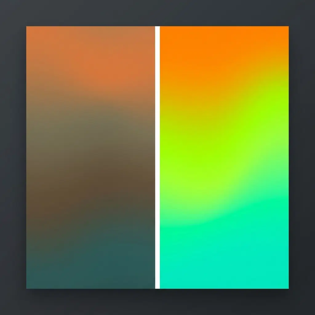
A gradient from orange to teal in standard CSS produces a grey-brown band halfway across. Switch the interpolation space with linear-gradient(in oklch, ...) and that band turns into a clean lime green. Nothing else about the declaration changes. Two words, and the gradient stops looking cheap.
/* the problem */
background: linear-gradient(to right, #E8921A, #3ABDB0);

/* the fix */
background: linear-gradient(to right in oklch, #E8921A, #3ABDB0);
Open both in a browser and look at the 50% mark. That’s the whole argument.
Why sRGB gradients go grey
Browsers interpolate gradients in sRGB by default, which means they average the red, green and blue channels independently across the length of the gradient. Take that orange, roughly rgb(232 146 26), and that teal, roughly rgb(58 189 176). The midpoint lands at rgb(145 168 101), a muted olive that neither of your source colours predicted.
The math isn’t wrong. sRGB just isn’t perceptually uniform. Equal numeric steps in sRGB don’t look like equal steps to your eye, and the straight line between two saturated colours passes through the low-chroma centre of the colour cube. Every two-colour gradient you’ve ever built with distant hues has been dipping through that dead zone.
Designers have worked around this for years by adding a midpoint stop. You pick a colour that looks right in the middle, drop it in at 50%, and the gradient stops sagging. That works, and it’s also a workaround for a coordinate system problem you can now solve at the source.
What OKLCH does differently
OKLCH is a polar representation of the Oklab colour space. Three components, plus optional alpha:
color: oklch(70% 0.15 240);
/*         │    │    └── Hue: 0 to 360 degrees */
/*         │    └─────── Chroma: 0 to roughly 0.4 */
/*         └──────────── Lightness: 0% to 100% */
Lightness behaves. This is the part people underestimate. In HSL, hsl(60 100% 50%) gives you a blinding yellow and hsl(240 100% 50%) gives you a dark blue, both at the same stated lightness of 50%. In OKLCH, oklch(70% 0.15 60) and oklch(70% 0.15 240) read as equally bright to a human eye. Chris Coyier has argued that uniform perceived lightness is the main reason to bother with OKLCH at all, and the odd shape of the colour space exists to serve exactly that.
Chroma is colourfulness, and it’s unbounded in principle. Practically you’ll live between 0 and 0.37. Values that exceed what a display can show get gamut-mapped by the browser rather than clipped, which is more graceful than the old behaviour.
Hue is an angle, same as HSL, though the angles don’t line up between the two systems. Blue sits near 264 in OKLCH, not 240.
When a browser interpolates in OKLCH it walks a path through a space built around how eyes work, so the midpoint stays as colourful as the endpoints. The grey band disappears because the path never enters the grey region.
Where to put the keyword
The interpolation hint goes inside the gradient function, after the direction if you have one:
/* direction first, then space */
background: linear-gradient(to right in oklch, #ff0080, #00d4ff);

/* angle works the same way */
background: linear-gradient(45deg in oklch, #ff0080, #00d4ff);

/* no direction, space on its own */
background: linear-gradient(in oklch, #ff0080, #00d4ff);

/* radial */
background: radial-gradient(circle in oklch, #ff0080, #00d4ff);

/* conic */
background: conic-gradient(from 0deg in oklch, #ff0080, #00d4ff, #ff0080);
Your colour stops can stay in hex. The browser converts them before interpolating, so you don’t have to rewrite a palette to get the benefit. That’s the fastest possible upgrade path: find every gradient in your stylesheet, add two words, ship. For more modern CSS architecture tricks and frontend styling guides, check out the latest tutorials on the conic.style homepage.
Hue interpolation, and the thing that catches people out
Because hue is an angle, a browser going from one hue to another has a choice about which way round the wheel to travel. CSS gives you four options.
background: linear-gradient(in oklch shorter hue, #ff0000, #0000ff);
background: linear-gradient(in oklch longer hue, #ff0000, #0000ff);
background: linear-gradient(in oklch increasing hue, #ff0000, #0000ff);
background: linear-gradient(in oklch decreasing hue, #ff0000, #0000ff);
shorter hue is the default and takes the shortest arc. longer hue goes the other way round, passing through every hue in between, which turns a two-colour declaration into a full spectrum sweep. That’s the trick behind most of the rainbow gradients you’ve seen that only list two colours.
/* full spectrum from two stops */
.rainbow {
  background: linear-gradient(to right in oklch longer hue,
    oklch(70% 0.25 0),
    oklch(70% 0.25 359)
  );
}
Set the two hues one degree apart and ask for the long way round. The browser walks all 359 degrees between them.
One gotcha with transparency. When you interpolate to transparent, the browser treats that as transparent black in some spaces and carries hue information in others. Interpolating in OKLCH with a transparent stop keeps the hue of the neighbouring stop rather than fading through grey, which is usually what you wanted anyway. If you’re getting odd results, name the transparent colour explicitly:
/* instead of transparent, fade the alpha of the actual colour */
background: linear-gradient(in oklch,
  oklch(60% 0.2 250 / 1),
  oklch(60% 0.2 250 / 0)
);
Conic gradients specifically
Conic gradients suffer worse than linear ones, because a colour wheel or a multi-stop pie passes through several hue transitions and every one of them can sag. Building a progress ring, a gauge or a chart segment in sRGB gives you dull bands between segments.
.progress-ring {
  --value: 68;
  background: conic-gradient(in oklch,
    oklch(72% 0.19 145) 0%,
    oklch(72% 0.19 145) calc(var(--value) * 1%),
    oklch(92% 0.02 145) calc(var(--value) * 1%),
    oklch(92% 0.02 145) 100%
  );
  border-radius: 50%;
  mask: radial-gradient(circle, transparent 60%, black 60.5%);
}
Two things worth copying from that snippet beyond the colour space. Keeping the same hue and chroma across the filled and unfilled segments, changing only lightness, gives you a track that reads as the same colour family. And a radial mask beats stacking a white circle on top, since it survives a coloured background.
For a full colour wheel:
.wheel {
  background: conic-gradient(in oklch longer hue,
    oklch(65% 0.28 0),
    oklch(65% 0.28 359)
  );
  border-radius: 50%;
}
Compare that to the equivalent built from twelve hex stops in sRGB. The OKLCH version has even brightness all the way round, which the sRGB version never manages because yellow always blows out and blue always sinks.
Fallbacks
Support for oklch() and for gradient interpolation hints landed across Chrome, Edge, Firefox and Safari, so most traffic gets the good version. Older engines drop the whole declaration if they can’t parse it, which means an unsupported browser shows no background at all rather than a degraded one. Guard against that.
The simplest pattern is declaration order. Write the sRGB version first, the OKLCH version second, and let the cascade sort it out:
.hero {
  /* parsed by everything */
  background: linear-gradient(to right, #E8921A, #7BA34D, #3ABDB0);
  /* dropped by engines that can't parse it */
  background: linear-gradient(to right in oklch, #E8921A, #3ABDB0);
}
Note the fallback has a hand-picked middle stop and the modern one doesn’t. That’s the point: you’re hand-tuning the old version to approximate what OKLCH does automatically.
For anything more involved, use a feature query:
@supports (background: linear-gradient(in oklch, red, blue)) {
  .hero { background: linear-gradient(to right in oklch, #E8921A, #3ABDB0); }
}
Testing for color: oklch(0% 0 0) checks a different thing, whether the colour function parses, and a browser could in principle support one without the other. Test what you’re using.
Copy-paste presets
Four that work across dark and light layouts. Every one uses the same lightness for both stops, so the gradient shifts hue without shifting brightness.
Sunset, warm to cool
background: linear-gradient(135deg in oklch,
  oklch(72% 0.19 45), oklch(72% 0.19 340));
Deep ocean, for dark UI
background: linear-gradient(160deg in oklch,
  oklch(38% 0.12 250), oklch(28% 0.10 285));
Soft wash, for cards on white
background: linear-gradient(to bottom right in oklch,
  oklch(97% 0.02 250), oklch(95% 0.03 320));
Signal, for buttons and badges
background: linear-gradient(to right in oklch,
  oklch(65% 0.22 25), oklch(65% 0.22 60));
Tune them by changing one number at a time. Moving lightness moves both stops together if you edit both, which keeps the gradient balanced. Moving one stop’s chroma without the other creates a gradient that fades in intensity, which sometimes reads as depth and sometimes reads as a rendering bug.
Relative colour syntax, which pairs well with this
Once your palette lives in OKLCH you can derive colours from a single brand token rather than maintaining a list.
:root { --brand: oklch(62% 0.21 264); }

.card {
  background: linear-gradient(to bottom in oklch,
    oklch(from var(--brand) calc(l + 0.12) c h),
    oklch(from var(--brand) calc(l - 0.08) c calc(h + 20))
  );
}
Change --brand and the gradient follows. This is the part that makes OKLCH worth adopting at the design system level rather than as a per-gradient trick, and it’s why Tailwind moved its default palette to OKLCH in v4.
color-mix() works in the same space:
background: linear-gradient(to right in oklch,
  var(--brand),
  color-mix(in oklch, var(--brand), white 40%)
);
When sRGB is fine
Not every gradient needs this.
Two colours close together on the wheel, or a light-to-slightly-darker version of one hue, produce nearly identical output in both spaces. A subtle background wash from #fafafa to #f0f0f0 has no muddy middle to fix. Adding the keyword there costs you a fallback declaration and buys nothing.
The benefit shows up when hues sit far apart, when chroma is high, or when the gradient is large enough that a viewer’s eye rests on the midpoint. Hero sections, full-bleed backgrounds, conic charts and colour wheels all qualify. A 2px underline does not.
There’s also a case against OKLCH for specific pairs. Interpolating between two colours whose hues sit almost opposite each other can take a path that looks technically correct and aesthetically wrong, passing through a hue neither designer nor developer wanted. When that happens, add an explicit middle stop in OKLCH rather than reverting to sRGB.
Debugging a gradient that looks wrong
Bands appear in a smooth gradient. That’s dithering, not colour space. Large gradients on 8-bit displays show stepping regardless of interpolation. Add a subtle noise overlay or increase the gradient’s angle so the bands run diagonally and read as less regular.
Colours look more saturated than expected. OKLCH lets you specify chroma values outside the sRGB gamut. On a P3 display those render; on an sRGB display the browser maps them inward. If your gradient looks different on a laptop and a phone, check whether your chroma exceeds about 0.24 at that lightness.
The gradient reverses direction in Safari. Check for a stray to right after the in oklch keyword. The order is direction, then space, and getting it backwards makes some parsers fall back silently.
Nothing renders at all. A parse error somewhere in the declaration kills the whole thing. Comment out the gradient, add it back one stop at a time.
Animating a gradient properly
You can’t transition a background-image between two gradient values. Browsers treat gradients as images and won’t interpolate them. What you can animate is a custom property, provided you register its type first.
@property --grad-hue {
  syntax: '<number>';
  initial-value: 200;
  inherits: false;
}

.animated {
  --grad-hue: 200;
  background: linear-gradient(135deg in oklch,
    oklch(68% 0.2 var(--grad-hue)),
    oklch(68% 0.2 calc(var(--grad-hue) + 60))
  );
  transition: --grad-hue 600ms ease;
}

.animated:hover { --grad-hue: 320; }
Because both stops derive from one variable, the pair moves together and the gradient keeps its internal relationship while shifting hue. Doing the same thing with two independent hex values means writing a keyframe for every step and watching the midpoint sag on every frame.
A continuous version, for hero backgrounds:
@keyframes drift {
  to { --grad-hue: 560; }  /* 200 + 360, a full rotation */
}

.hero {
  animation: drift 24s linear infinite;
}
Twenty-four seconds is slow enough that nobody consciously notices the movement, which is the effect you want. At six seconds it reads as a loading state.
Respect motion preferences:
@media (prefers-reduced-motion: reduce) {
  .hero { animation: none; }
}
Gradient text without the mud
Text clipped to a gradient is where the muddy midpoint gets brutal, because the letters are thin and the eye reads colour against a background at high frequency. A sagging midpoint on a headline looks like a rendering fault.
.gradient-heading {
  background: linear-gradient(100deg in oklch,
    oklch(58% 0.22 268),
    oklch(58% 0.22 340)
  );
  background-clip: text;
  color: transparent;
}
Two rules for this to survive contact with real content. Keep lightness under about 62% for text on white, because gradient text loses contrast at the light end and screen readers won’t save you from a headline nobody can read. And set a color fallback before the clip in case background-clip: text fails, otherwise unsupported browsers render invisible text:

.gradient-heading {
  color: oklch(58% 0.22 300);  /* fallback, sits between the two stops */
}
@supports (background-clip: text) {
  .gradient-heading { color: transparent; }
}
Contrast and accessibility
OKLCH makes contrast easier to reason about but doesn’t do the work for you. WCAG contrast ratios are calculated from relative luminance in sRGB, which doesn’t map cleanly onto OKLCH lightness. A pair of colours at 45% and 85% OKLCH lightness usually clears 4.5:1, though the margin narrows at high chroma and at hues near yellow.
For text over a gradient, test both endpoints rather than the middle. The middle is a blend of two colours you already checked, so if both ends pass, the middle passes. If one end fails, the headline fails somewhere along its length and you won’t spot it in a screenshot taken at one viewport width.
A practical rule for buttons and badges: pick your two stops at the same lightness value, then set text colour once against that lightness. A gradient that varies only in hue has a constant contrast ratio against white or black text, which removes the whole problem.
.badge {
  /* both stops at 62% lightness, so contrast is uniform */
  background: linear-gradient(to right in oklch,
    oklch(62% 0.18 25), oklch(62% 0.18 55));
  color: white;
}
How the colour spaces compare
| Lightness behaves | Hue is an angle | Wide gamut | Support in gradients | Best for | |
|---|---|---|---|---|---|
| sRGB / hex | No | No | No | Default everywhere | Fallbacks, close-hue gradients |
| HSL | No | Yes | No | Yes | Quick tweaks, legacy code |
| LCH | Yes | Yes | Yes | Yes | Print-adjacent work |
| OKLCH | Yes | Yes | Yes | Yes | Gradients, design tokens, palettes |
LCH and OKLCH look similar in syntax and differ in foundation. LCH builds on CIELAB, OKLCH on Oklab. The practical difference shows up in blues: LCH shifts hue noticeably as lightness changes, so a “same blue, lighter” derivation drifts purple. Oklab was designed to fix that, which is why the CSS community landed on OKLCH rather than LCH for design systems.
Converting an existing palette
Moving a stylesheet to OKLCH doesn’t need a rewrite. Two approaches, depending on how much time you have.
Minimum effort. Leave every colour as hex. Add in oklch to gradients only. You get the interpolation benefit and touch nothing else. An afternoon of work on a large codebase, and the diff is easy to review.
Full token migration. Convert your palette to OKLCH values, then derive the scale by adjusting lightness on a fixed hue and chroma. This is where the payoff compounds, because a nine-step colour ramp becomes nine lightness values rather than nine hand-picked hex codes that drift in hue as they get lighter.
:root {
  --blue-100: oklch(94% 0.03 264);
  --blue-300: oklch(80% 0.09 264);
  --blue-500: oklch(62% 0.21 264);
  --blue-700: oklch(48% 0.17 264);
  --blue-900: oklch(32% 0.11 264);
}
Chroma drops at the extremes because the gamut narrows there. Holding chroma constant across the full ramp pushes the light end out of gamut and the browser maps it back, giving you two steps that render identically. Taper it.
When you convert, expect the numbers to look wrong at first. #3b82f6 becomes roughly oklch(62% 0.19 258), and nobody reads that and pictures a blue. The readability tradeoff is real, and it’s why hex isn’t going anywhere for one-off values. Reserve OKLCH for tokens you derive from.
Stacking gradients, and why the space matters more when you layer
One background property can hold several gradients separated by commas. The first one listed paints on top, and any layer above needs transparency for the ones below to show.
.layered {
  background:
    radial-gradient(60% 80% at 20% 15% in oklch,
      oklch(70% 0.24 320 / 0.55), transparent 70%),
    radial-gradient(70% 70% at 85% 30% in oklch,
      oklch(74% 0.22 200 / 0.5), transparent 70%),
    linear-gradient(180deg in oklch,
      oklch(28% 0.08 265), oklch(18% 0.05 280));
}
Every layer needs its own in oklch. The keyword is per-gradient, not per-declaration, and forgetting it on one layer produces exactly one dull patch that takes twenty minutes to find.
Layering multiplies the midpoint problem. Two overlapping sRGB gradients each sag in the middle, and where the sags overlap you get a grey blot that neither gradient produces alone. Move both to OKLCH and the overlap stays colourful, which is why this technique only started looking good after interpolation hints shipped. This pristine blending is exactly why the OKLCH space is absolutely essential if you want to create beautiful CSS mesh gradients without using canvas or external generators.
Watch alpha values here. Interpolating a semi-transparent stop to transparent in OKLCH keeps the hue, so the fade reads as the colour dissolving rather than turning grey first. That single behaviour is what makes soft radial washes work.
Three places this pays off immediately
Buttons. A gradient button in sRGB with a 60-degree hue span looks slightly dirty and nobody can articulate why. Same button in OKLCH looks like a product from a company with a design team. Cost of the change: two words.
Charts. Anything with a colour scale, heat maps included, benefits from perceptually even steps. A five-step scale built by varying OKLCH lightness on one hue gives readers steps that look evenly spaced. The same scale in hex, picked by eye, always has one step that reads as a jump.
Dark mode. Deriving a dark palette from a light one by inverting lightness works in OKLCH and fails in HSL. In HSL your yellows go muddy and your blues go black because the lightness number lies. In OKLCH, calc(1 - l) gets you something usable on the first attempt, which you then tune rather than rebuild.
FAQ
What does in oklch do in a CSS gradient?
It tells the browser to interpolate between colour stops in the OKLCH colour space rather than the default sRGB. Because OKLCH is perceptually uniform, the intermediate colours keep their chroma instead of sagging toward grey at the midpoint. Your colour stops can stay in any notation, including hex, since the browser converts them before interpolating.
Is OKLCH better than HSL?
For gradients and for design systems, yes. HSL’s lightness value doesn’t correspond to perceived brightness, so hsl(60 100% 50%) looks far brighter than hsl(240 100% 50%) despite both claiming 50%. OKLCH fixes that, which makes deriving a palette by adjusting one number reliable. HSL keeps one advantage: everyone already understands it, and its saturation scale of 0 to 100% is easier to reason about than chroma’s 0 to 0.4.
Which browsers support OKLCH gradients?
Current versions of Chrome, Edge, Firefox and Safari all support both oklch() and gradient interpolation hints. Older engines drop the entire declaration rather than degrading, so write an sRGB declaration first as a fallback or wrap the modern version in an @supports block.
Can I use hex colours with OKLCH interpolation?
Yes. linear-gradient(to right in oklch, #E8921A, #3ABDB0) is valid. The browser converts both hex values into OKLCH, interpolates there, then converts back for rendering. You get the benefit without rewriting your palette, which makes this the cheapest visual upgrade available in CSS right now.
How do I make a rainbow gradient with only two colours?
Use longer hue and set your two stops one degree apart: linear-gradient(in oklch longer hue, oklch(70% 0.25 0), oklch(70% 0.25 359)). The browser takes the long path around the hue wheel and passes through every hue between them, at constant lightness.
Does OKLCH work with conic gradients?
Yes, and conic gradients benefit more than linear ones. A conic gradient crosses multiple hue transitions, so every sag in sRGB shows up as a dull band between segments. Progress rings, gauges and colour wheels are the clearest wins.
What’s the difference between in oklch and in oklab?
Both interpolate in the same underlying colour space. oklab uses cartesian coordinates and takes a straight line between two points, while oklch uses polar coordinates and rotates through hue. For two colours with similar hue the output is nearly identical. For distant hues, oklab cuts across the middle of the space and loses some chroma, while oklch travels around the outside and keeps it. Use oklch for gradients where the colours differ in hue, and oklab when you want the shorter, less colourful path.
Will the gradient look the same on every screen?
No, and that predates OKLCH. A P3 display renders chroma values an sRGB laptop can’t, so a saturated gradient looks more intense on a recent phone than on an older monitor. OKLCH makes this predictable rather than random, because the browser gamut-maps out-of-range colours inward along a defined path. Keep chroma under roughly 0.24 if you want output that matches across displays, and go higher when you’re deliberately targeting wide-gamut screens.